Image Gallery Examples
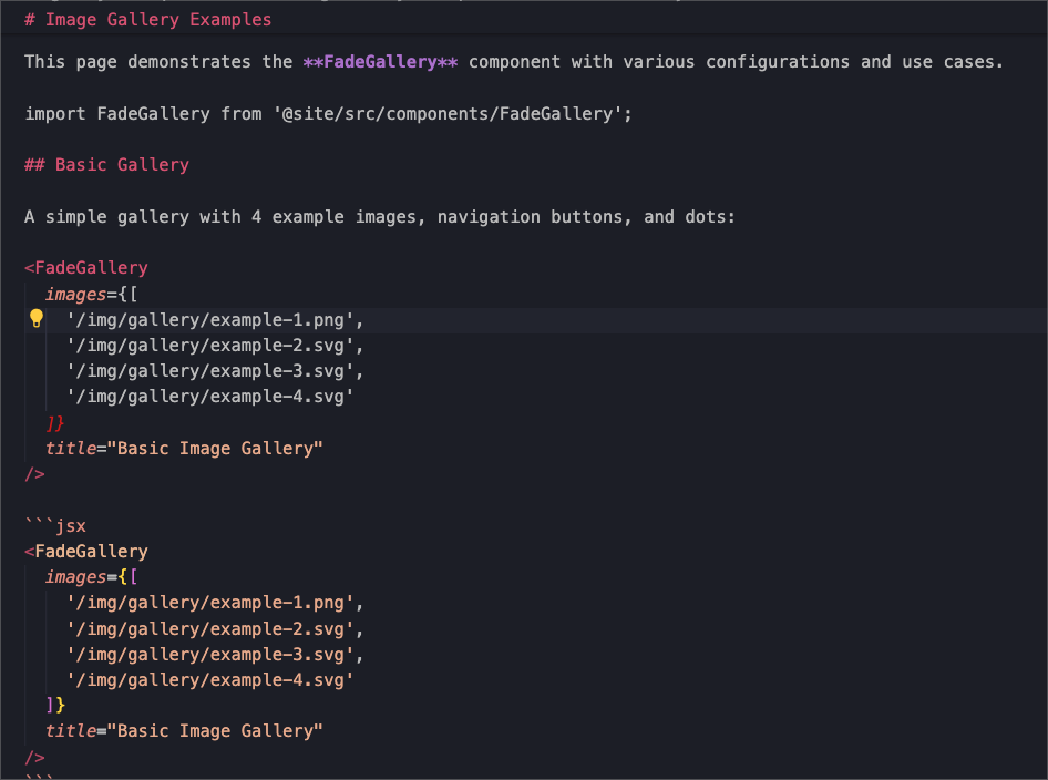
This page demonstrates the FadeGallery component with various configurations and use cases.
Basic Gallery
A simple gallery with 4 example images, navigation buttons, and dots:
Basic Image Gallery


<FadeGallery
  images={[
    '/img/gallery/example-1.png',
    '/img/gallery/example-2.svg',
    '/img/gallery/example-3.svg',
    '/img/gallery/example-4.svg'
  ]}
  title="Basic Image Gallery"
/>
Auto-Play Gallery
This gallery automatically transitions between images every 3 seconds:
Auto-Play Gallery (3s intervals)


<FadeGallery
  images={[
    '/img/gallery/example-2.svg',
    '/img/gallery/example-4.svg',
    '/img/gallery/example-1.svg'
  ]}
  title="Auto-Play Gallery (3s intervals)"
  autoplay={3000}
/>
Minimal Gallery
A clean gallery without navigation buttons or dots:
Minimal Gallery


<FadeGallery
  images={[
    '/img/gallery/example-3.svg',
    '/img/gallery/example-1.svg'
  ]}
  title="Minimal Gallery"
  showButtons={false}
  showDots={false}
/>
Gallery Without Title
Sometimes you might want a gallery without a title:


<FadeGallery
  images={[
    '/img/gallery/example-4.svg',
    '/img/gallery/example-2.svg',
    '/img/gallery/example-3.svg'
  ]}
  autoplay={4000}
/>
Component Props
The FadeGallery component accepts the following props:
| Prop | Type | Default | Description |
|---|---|---|---|
images | string[] | Required | Array of image paths (relative to /static/ or absolute URLs) |
title | string | undefined | Optional title displayed above the gallery |
autoplay | number | undefined | Auto-play interval in milliseconds. If not provided, auto-play is disabled |
showDots | boolean | true | Show/hide navigation dots |
showButtons | boolean | true | Show/hide previous/next buttons |
Features
✨ Key features of the FadeGallery component:
- Smooth fade transitions between images using Embla Carousel
- Touch/swipe support on mobile devices
- Keyboard navigation (arrow keys)
- Theme awareness - automatically adapts to light/dark mode
- Responsive design - works on all screen sizes
- Auto-play functionality with customizable intervals
- Accessibility support with proper ARIA labels
- Server-side rendering compatible with fallback display
Usage Tips
💡 Best practices when using the FadeGallery:
- Image paths: Place your images in the
/static/img/directory and reference them as/img/your-image.jpg - Image sizes: For best results, use images with similar aspect ratios
- Performance: Optimize your images for web (WebP format recommended)
- Accessibility: Ensure your images have meaningful alt text (the component automatically generates basic alt text)
- Auto-play: Use auto-play sparingly and provide users with pause controls when needed
Customization
The gallery automatically inherits your site's theme colors and styling. The fade effect duration and easing can be customized by modifying the CSS module if needed.
This component is built with Embla Carousel and integrates seamlessly with Docusaurus themes.